
Client
Self-directed, 2019
Services
Research, branding, photography, illustration
The Società Caruso, an Italian social club in Sudbury’s West End, has operated for over 70 years without ever establishing a cohesive visual identity. My brand proposal positions the Caruso as an upscale events venue while honouring the club’s roots.
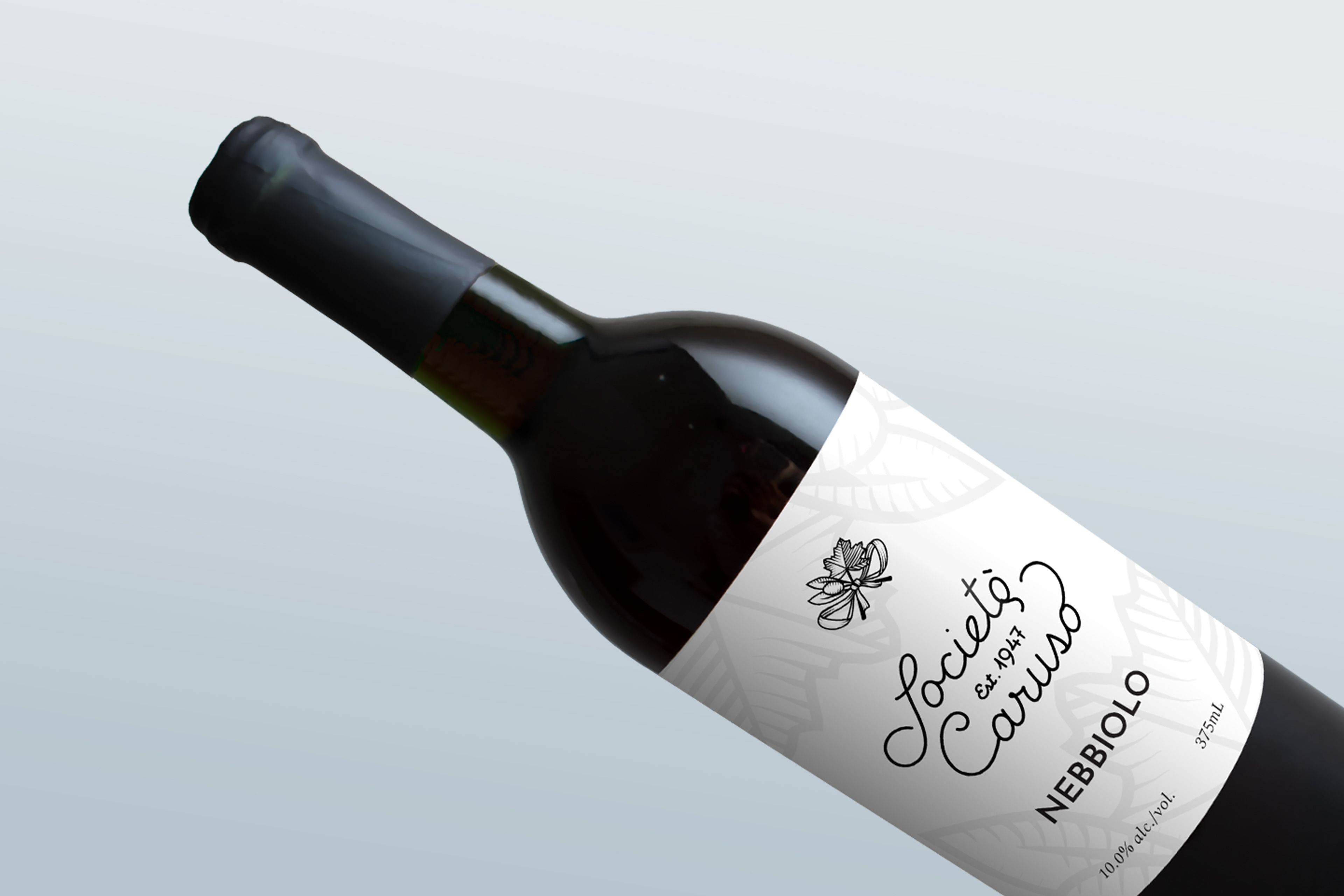
In addition to being culturally authentic, the various brand elements help set the Caruso apart from its competitors: where many local businesses use the Italian flag colours in their branding, the Caruso palette features a deep azure, the country’s other traditional colour. Meanwhile, the logo is inspired by the calligraphy in old letters sent from Italy, giving it a unique character that immediately stands out from generic script typefaces.
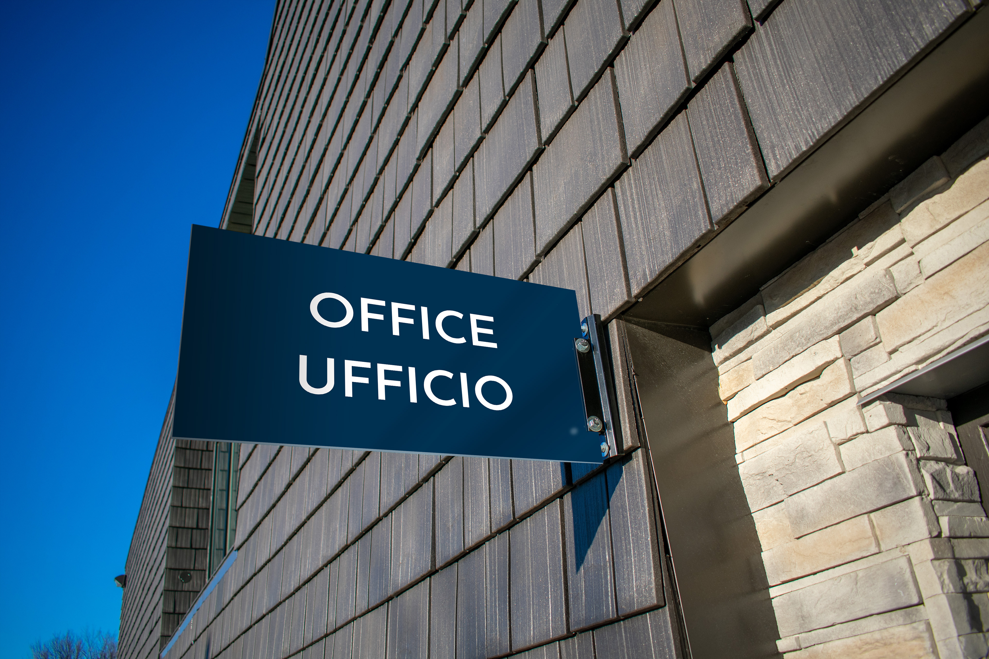
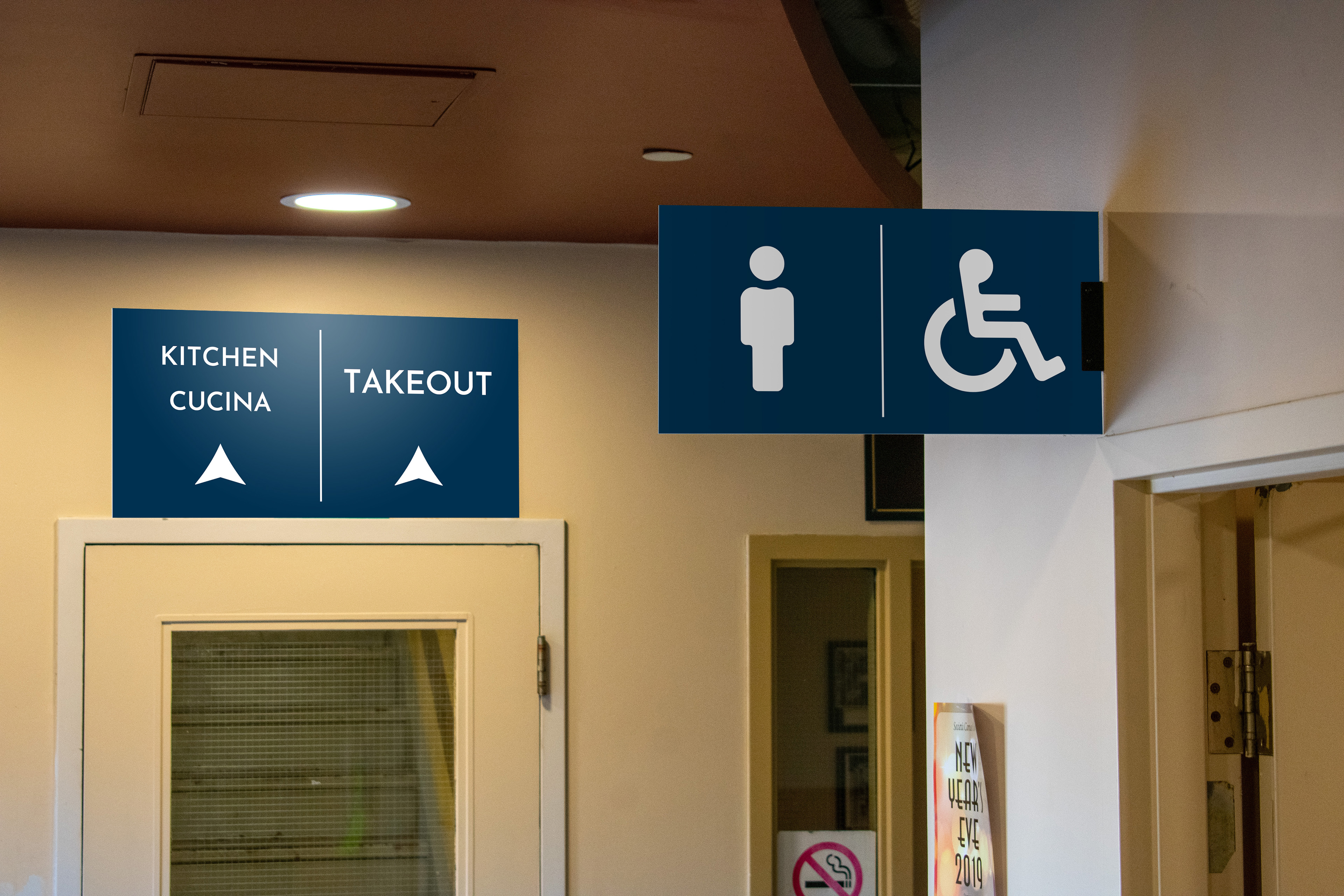
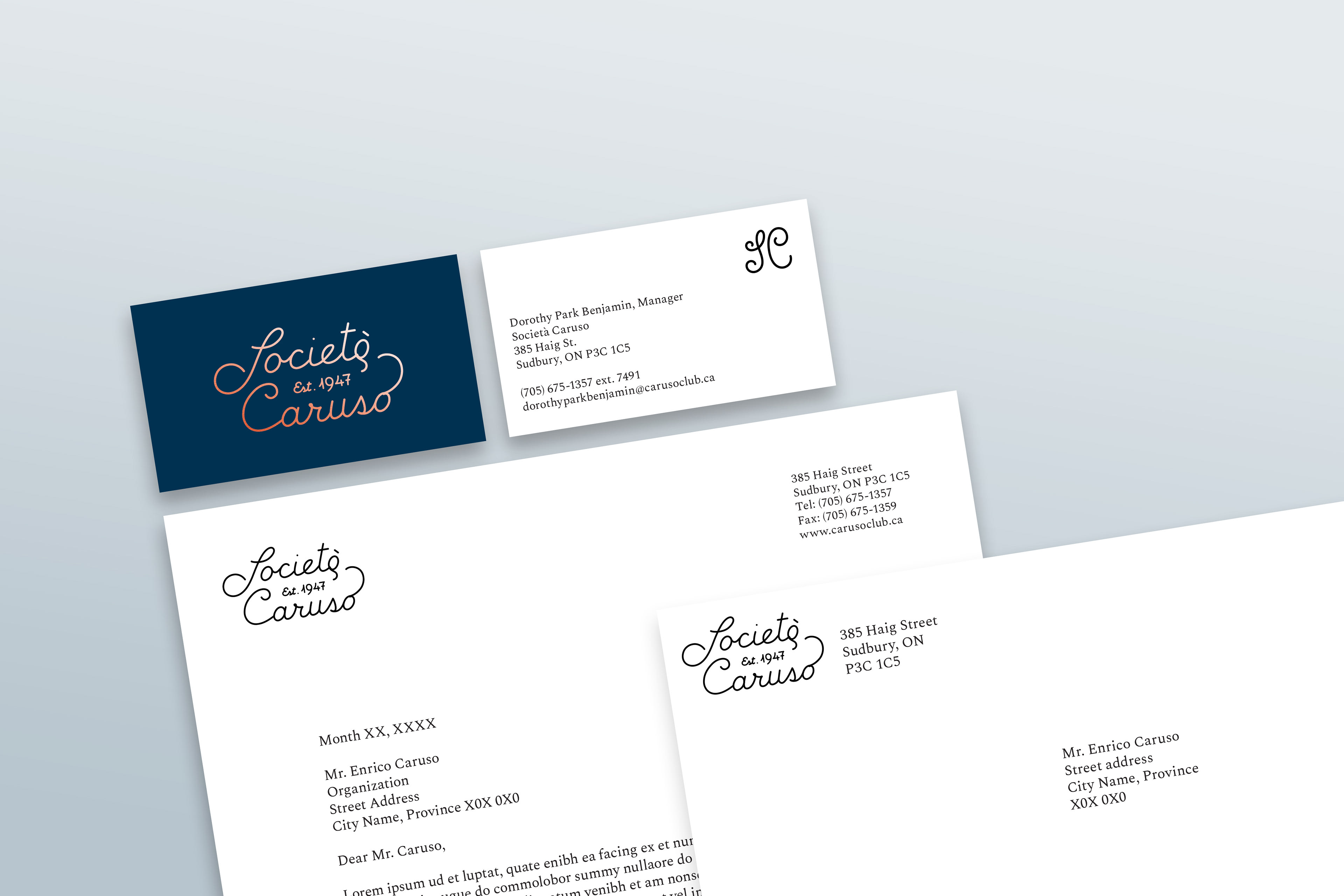
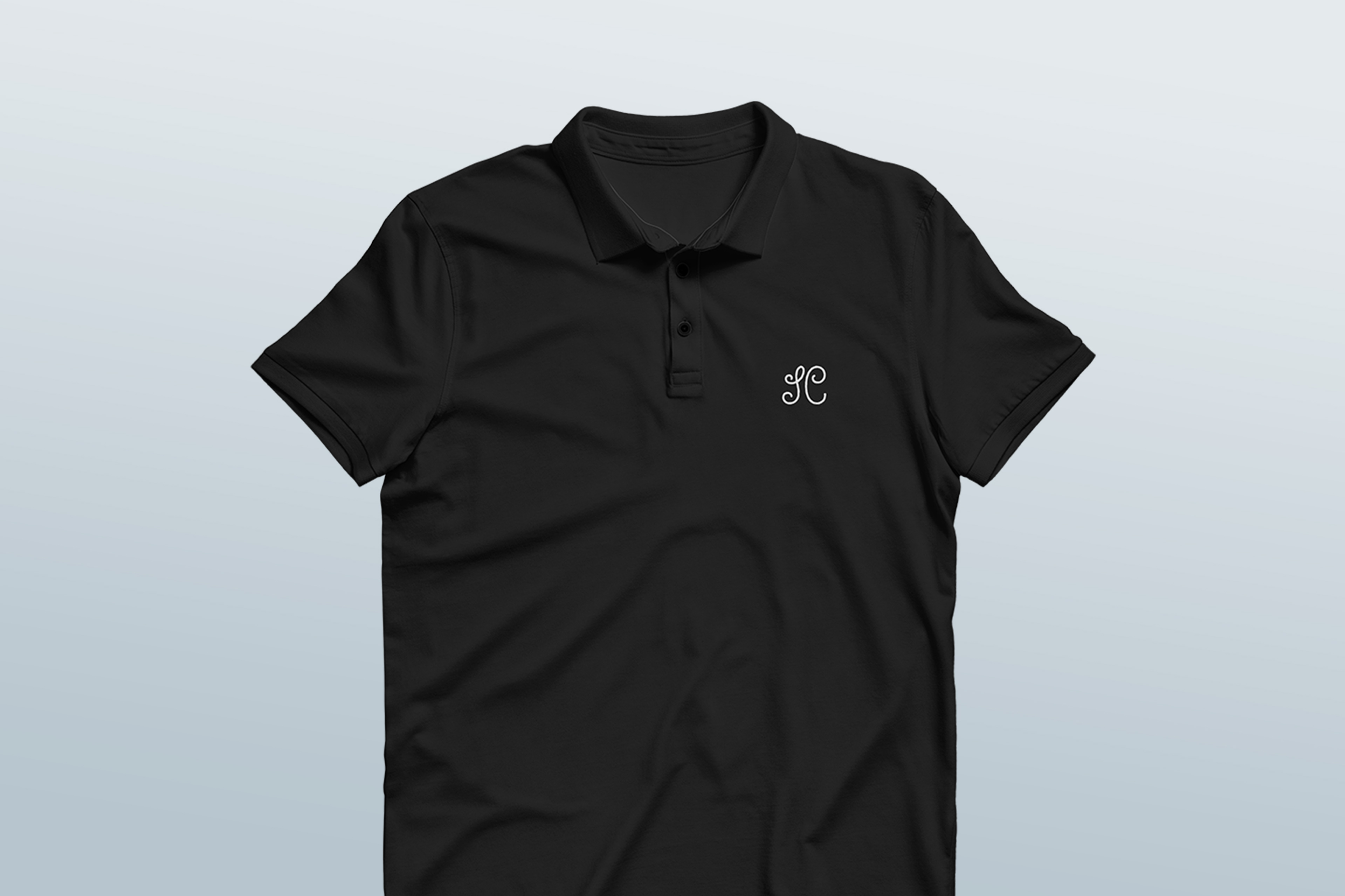
In application, the identity is spare and formal. Vintage type and engravings—a maple branch for Canada and an olive for Italy—add a touch of elegance and Old World charm. As the Società is not-for-profit, collateral is inexpensive to produce and maximally useful in regular operations.